Brand Guidelines and Usage
The College of Southern Maryland's brand guidelines provide standards for consistent and effective use of its brand elements across all communications.
Learn how to do it right. Logos, promotional items, websites, and more: learn how to use them to support our brand.
Jump to a topic:
Logo Guidelines
The visual standards of the college help to define appearance and the unique characteristics of CSM.
Maintaining consistency within our visual elements helps to define and differentiate the College of Southern Maryland among our competition. Repetition of our visual elements helps to establish CSM in the minds of our audiences.
The purpose of these standards is to:
- Reinforce the College of Southern Maryland’s identity
- Ensure continuity in appearance of all communications
- Present a positive consistent image of CSM
- Protect and regulate the use of proprietary CSM logo marks and graphics
It is important that all faculty and staff understand these guidelines and adhere to these standards.
View guidelines below and reach out to marketing@csmd.edu if you have questions. Any publication using the college logo must be reviewed by the Marketing and Communications Department prior to publication.
Logo Position
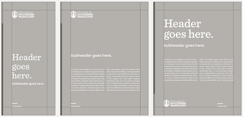
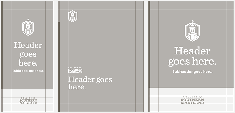
For the institutional brand, the primary logo should live in the top left corner or the bottom left corner of the design. The accompanying text should be aligned with the crest. In instances where you have more space, the text can be aligned to the wordmark.
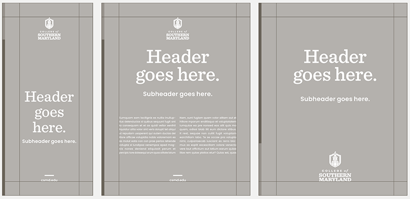
The stacked logo works best with centered layouts. It may be placed in the top center or the bottom center of the document. It can also be centered within a block of color.
If the crest is separated from the wordmark, it’s essential that both elements reside within the same document. You have the flexibility to scale the crest and wordmark to suit the design. While the crest can serve as a decorative element, it should not be rotated or cropped.
Consider: Color, Sizing, Clear Space
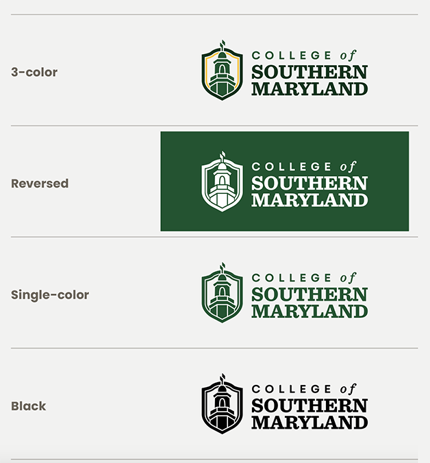
For versatility and adaptability, each CSM logo composition is offered in four distinct applications: 3-color, reversed, single-color, and black. The 3-color application is the preferred choice and should be used whenever feasible. In instances with dark backgrounds, the reversed option is appropriate. The green version is suitable for light backgrounds that cannot support the 3-color version, such as over a photograph. The black option should be used sparingly and only when it is the last resort.
In order to ensure legibility, the CSM logo must appear at a size that retains its details. To ensure our logo is always legible, our logo should not be reproduced at a size smaller than those outlined below:
- Primary horizontal logo: Width: 1.375 in / 100 px
- Stacked vertical logo: Width: 1 in / 72 px
- Abbreviated horizontal logo: Width: 1 in / 72 px
- Abbreviated vertical logo: Width: .625 in / 45 px

To maintain legibility and prominence, it is crucial to ensure clear space around the logo. Use the crest as a measuring tool to guide the appropriate spacing for photos, text, and graphic elements as demonstrated in the guidelines provided.

Incorrect Logo Usage
Things to Avoid
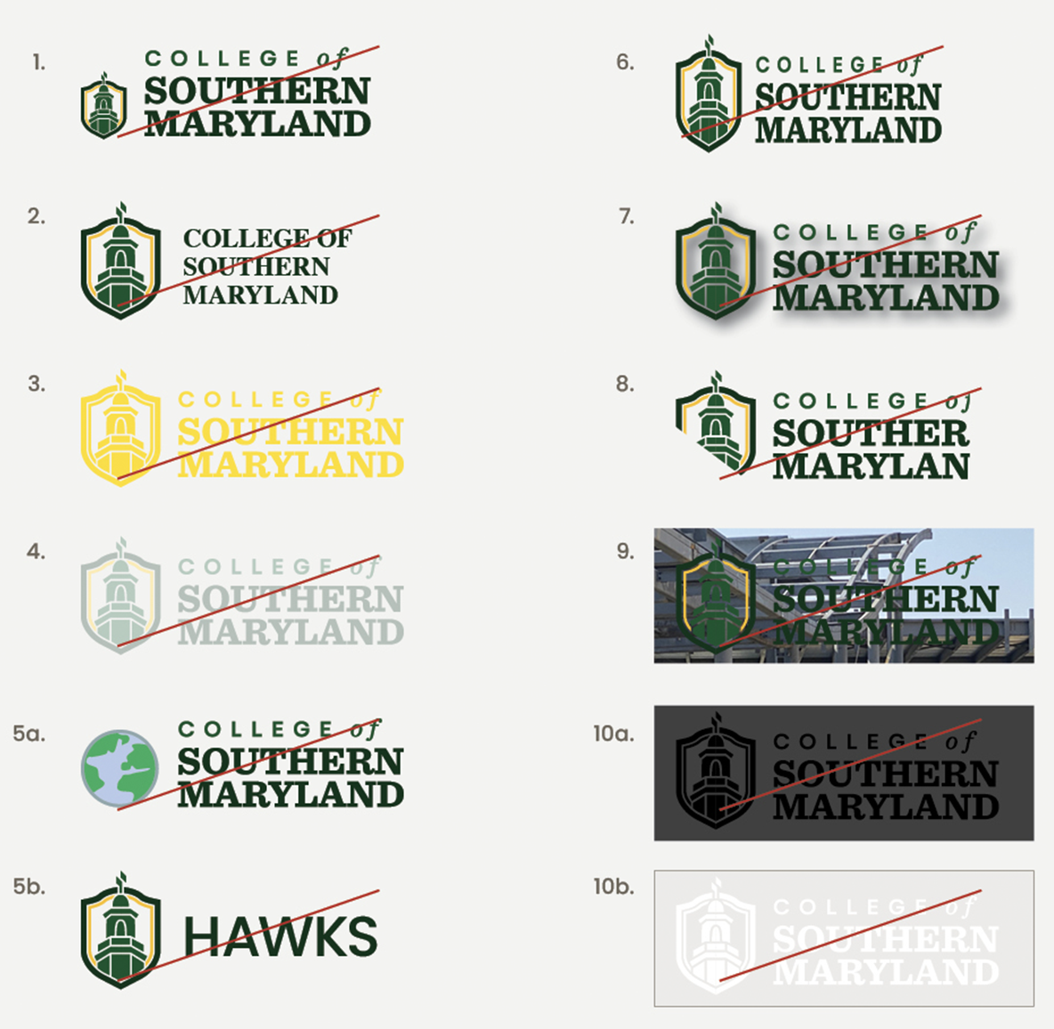
- 1. Avoid altering the logo in any way except to enlarge or reduce it proportionally. Do not change the size, placement, and relationship of the logo’s elements.
- 2. Do not use another typeface to spell out College of Southern Maryland or CSM in the logo.
- 3. Do not change the logo’s colors.
- 4. Do not screen back the logo.
- 5a. Do not combine another graphic element with the logo.
- 5b. Do not use the crest with other words.
- 6. Do not skew or distort the logo.
- 7. Do not apply effects to the logo.
- 8. Do not obscure parts of the logo.
- 9. Do not place the logo against a complex background.
- 10a. Do not use a solid black logo against a dark background.
- 10b. Do not reverse the logo to white when using a light background.
 my.CSMD
