Fonts and Typography
Primary Typefaces
Primary Serif Typeface
Our primary fonts should be used in all college communications. They are the purest tool for the expression of our brand voice and character and are appropriate for all media, occasions, and audiences.
Sentinel is CSM’s primary serif typeface family and is used in the CSM logo. It is bold, sophisticated, and comes in a variety of weights and styles.
Alternative type faces should only be used when Sentinel is not an available option.
Typeface
Sentinel
Characters
Aa Bb Cc Dd Ee Ff Gg Hh Ii Jj Kk Ll Mm Nn Oo Pp Qq Rr Ss Tt Uu Vv Ww Xx Yy Zz 1 2 3 4 5 6 7 8 9 0 @ # $ % ^ & * } ! ?
Styles
Sentinel Light
Sentinel Light Italic
Sentinel Book
Sentinel Book Italic
Sentinel Medium
Sentinel Medium Italic
Sentinel Semibold
Sentinel Semibold Italic
Sentinel Bold
Sentinel Bold Italic
Sentinel Black
Sentinel Black Italic
Google Alternative
Roboto
Microsoft Alternative
Georgia Pro
Primary Sans-Serif Typeface
Poppins is CSM’s primary sans-serif typeface family and is also used in the CSM logo. It is clean, modern, and comes in a variety of weights and styles.
Typeface
Poppins
Characters
Aa Bb Cc Dd Ee Ff Gg Hh Ii Jj Kk Ll Mm Nn Oo Pp Qq Rr Ss Tt Uu Vv Ww Xx Yy Zz 1 2 3 4 5 6 7 8 9 0 @ # $ % ^ & * } ! ?
Styles
Poppins Thin
Poppins Thin Italic
Poppins Extra Light
Poppins Extra Light Italic
Poppins Light
Poppins Light Italic
Poppins Regular
Poppins Italic
Poppins Medium
Poppins Medium Italic
Poppins Semibold
Poppins Semibold Italic
Poppins Bold
Poppins Bold Italic
Poppins Extrabold
Poppins Extrabold Italic
Poppins Black
Poppins Black Italic
Type Pairing
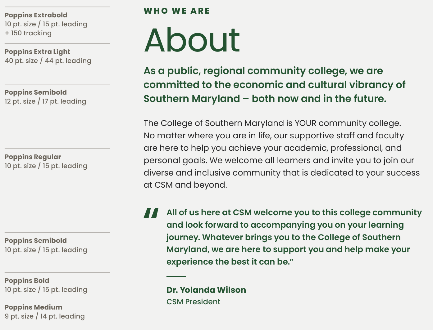
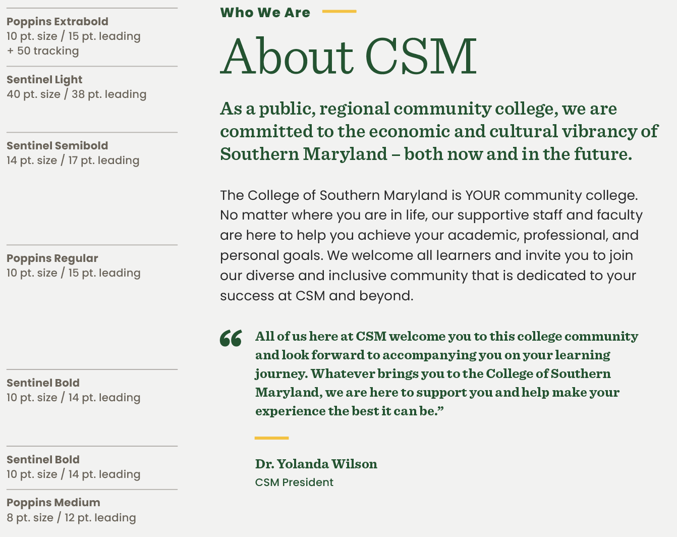
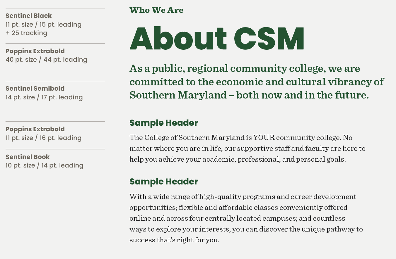
Typography, like color, has the power to convey a distinct tone or mood. By employing just two typefaces, we can curate a spectrum of moods ranging from formality and boldness to subtlety and casualness, achieved through the use of diverse styles and weights.Formal and Bold (Primary Type Pairing)
Our primary font pairing is formal and bold. It serves as the cornerstone of our institutional brand, consistently delivering a sense of identity and recognition.
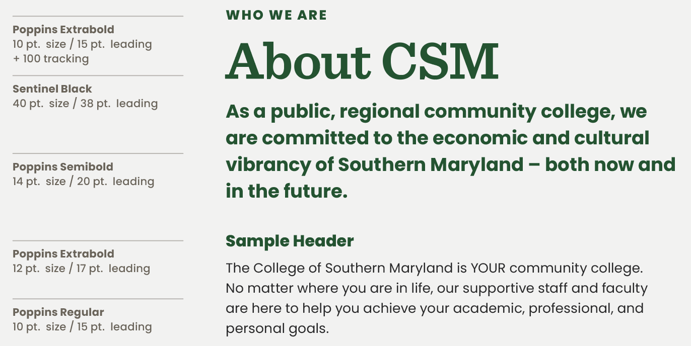
Using one of Sentinel’s lighter weights, you can portray a more subtle and formal tone through typography. The lighter weight of sentinel gives a more elegant and mature feel to the font.
Using Poppins for the main headline, while bold, is more casual, friendly, and approachable.
Using a lighter weight of Poppins for headlines allows for a more subtle and casual approach to the typography.